Branding
Every Pardon card carries your organisation's colour down the left edge and your name at the top, so people can tell a real message from IT apart from a pop-up they should ignore. Branding is two fields on the campaign:
"branding": { "org_name": "Lakeside IT", "accent": "#1e3a5f" }| Field | What it does |
|---|---|
org_name | Shown at the top of the card (up to 80 characters). Its first letter becomes the white tile on the sidebar. |
accent | Your brand colour as #rrggbb. |
The same toast in four brands:


Any colour stays readable
You don't need to pick a colour that "works". Pardon uses your exact colour on the sidebar, which carries no text. Where the colour sits behind white text (the main button) or is used as text, Pardon adjusts only its lightness until it meets the WCAG contrast minimum, keeping the hue. That is why the orange Summit button above is a shade darker than its sidebar, and why dark-mode buttons are a little lighter than in light mode.
An invalid colour doesn't break anything: the card falls back to Pardon's neutral slate, #334155.
Light and dark
Pardon follows the user's Windows setting (Settings > Personalization > Colors > app mode). There is nothing to configure.
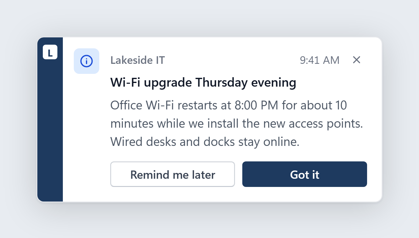
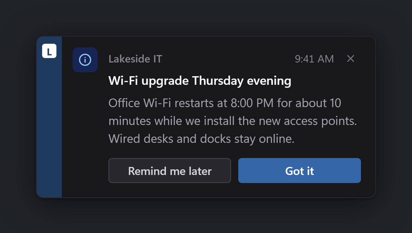
No branding
Leave branding out (as the --title one-liner does) and the card uses the neutral slate, with "Organization" as the name and O on the tile. It works, but people are more likely to trust and read a card with your name on it.
Not shown yet
The schema already accepts branding.logo (an image for the sidebar tile) and branding.support_link, and dialogs accept an image. This version does not draw them yet: the tile shows your initial, and a dialog image appears only as a captioned placeholder. Leave them out for now.